aaron enright + creative

aaron enright + creativeaaron enright + creativeaaron enright + creative

aaron enright + creative

aaron enright + creativeaaron enright + creativeaaron enright + creative
  • Home
  • Work
  • About
  • Kudos
  • Contact me
  • More
    • Home
    • Work
    • About
    • Kudos
    • Contact me
  • Home
  • Work
  • About
  • Kudos
  • Contact me

Blue Yonder Branding

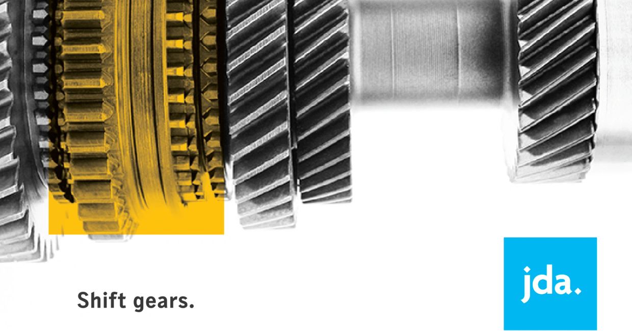
JDA rebrand

JDA rebrand

JDA rebrand

Note: JDA Software changed its name to Blue Yonder in 2020. 

You'll see the JDA rebrand work (2014/2015) first, then the progression of that brand, followed by the Blue Yonder brand work. 

JDA rebrand

JDA rebrand

The challenge


A rebrand isn't simply slapping a new logo and colors on things. It's a monumental undertaking, especially for a global brand. Not only did several hundred pieces of collateral need to be redesigned, the new brand voice and visual look/feel needed to be evident across the board, including a new website. All content needed to be edited and updated as well. Here's a short list of what needed to be done: the website, social ads, website and email (headers, banners, graphics, thumbnails), brochures, case studies, solution sheets, white papers, alliance/partner sheets, PowerPoints, print banners, wall graphics, and more. We needed to source new imagery, create templates, and other resource libraries, etc.  

The solution


Breathe and gather the core team. Set-up an execution strategy, define the process and workflow, define and align on realistic timelines, determine the amount of associates and contractors needed to help both design and update/create content, establish naming conventions, and more. 


Thinking holistically, I designed a brand system that made sense all the way down the line. I set-up templates that were easy to use and understand enabling designers to execute a wide variety of deliverables quickly, while maintaining a high level of design, and ensuring they were on brand. Teams across the organization and globe collaborated to streamline work flows, approvals, go-lives, and more. 

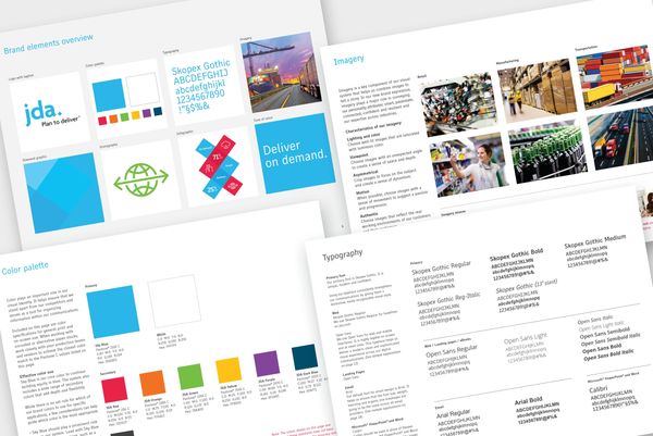
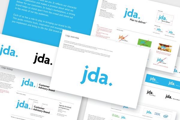
Initial brand guidelines

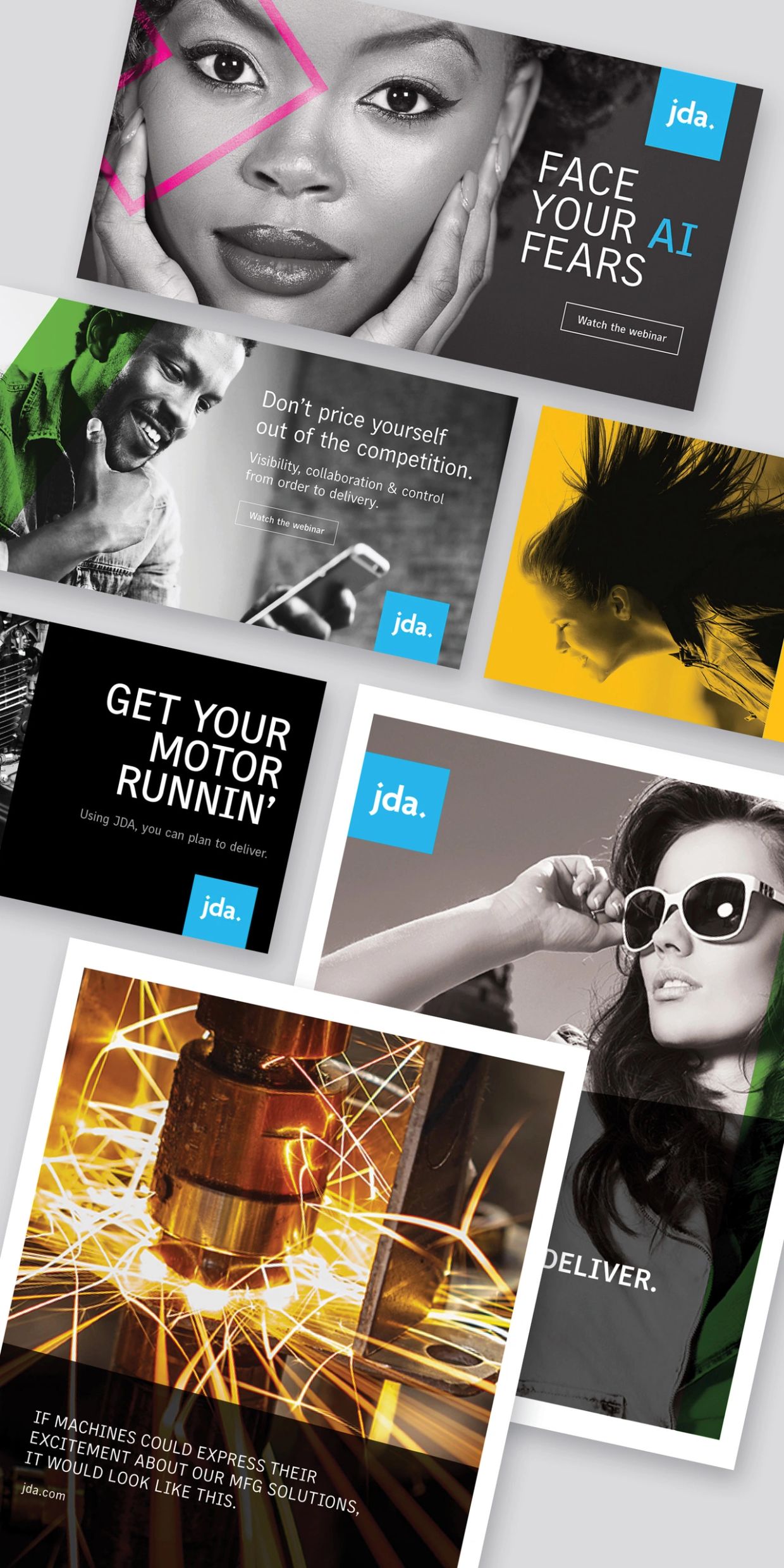
As you scroll down you will see a few examples of how we expanded and pushed the brand after it was established in the market. 
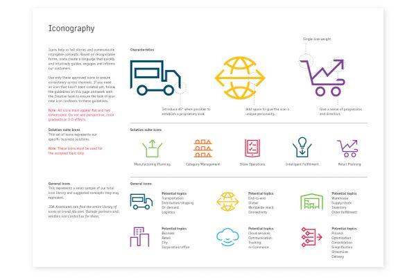
We designated icons, colors, and shapes for the various solutions.
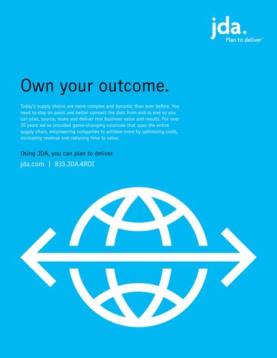
Collateral

We had six solution suites to create (hundreds of pieces), each represented with their own color and icon. Below is an example of the retail suite – Main Overview Brochure, Sub-solution Brochure, Solution Sheet, Case Study, and White Paper.

Solution Posters

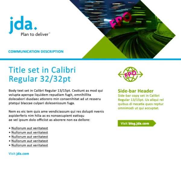
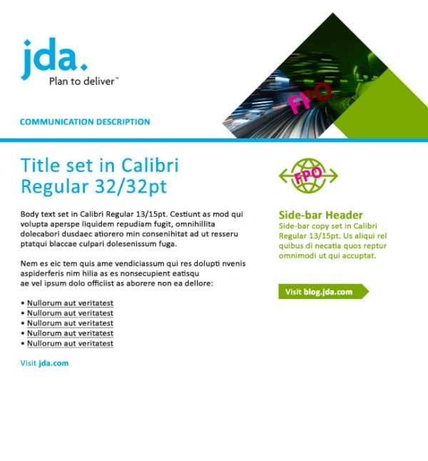
Emails

Emails

Emails
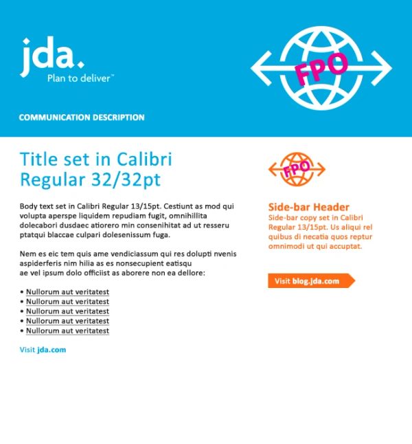
Emails

Emails
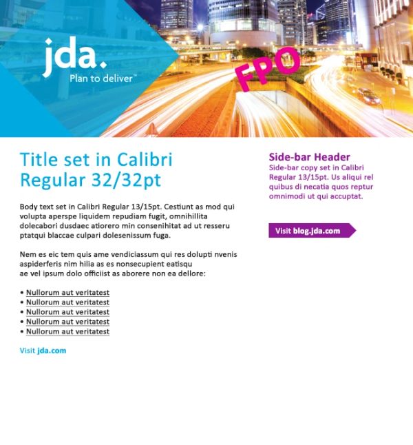
Brand evolution

Updated brand guidelines and expanded design

Blue Yonder branding

Blue Yonder branding

Blue Yonder branding

Blue Yonder branding

Blue Yonder branding

The challenge


What wasn't a challenge? We had to launch a completely new global brand in a timeframe that even Chuck Norris would think twice about taking on, while creating a strategic plan for post-launch activation so day-to-day operations would be minimally affected. 

The solution


Pre-launch activity focused on creating a brand "toolkit" of communications and brand system templates that associates could access on day one via the brand asset site. Post-launch activity focused on individual, team, company, and external vendor training to ensure immediate and short-term understanding and adherence of the brand was followed. Longer-reach plans included new-hire training, monthly brand reviews with internal and external creative resources along with a yearly brand review to assess and reevaluate agency partners as needed. 

Back to top
  • Home
  • Work
  • About
  • Kudos
  • Contact me

Copyright © 2026. Aaron Enright. All Rights Reserved.

This website uses cookies.

We use cookies to analyze website traffic and optimize your website experience. By accepting our use of cookies, your data will be aggregated with all other user data.

Accept